Design is everywhere. Quite Literally. Especially in our physical aka real world. From the pen you write with to the car you drive to work has been meticulously designed to make life easier for us. By working at Skcript for so long, I have improved my skills in various aspects of design and gained a few which I feel every designer should develop. One such skill is:
Learning to draw parallels from the physical world.
From the time you wake up in the morning until the time you go to bed, apart from using our phones, we use heck a lot of other physical products that we take for granted to an extent that we fail to observe that they're designed as well. Designed to solve a problem that we face in our life.
Some of them make our life easier

Others make us fall on our face

As designers, if we observe the way different products in the physical world are designed, what makes them easy to use and what doesn't, it'll help a great deal in applying those lessons while designing digital products.
Here are a few scenarios which I noticed from which we, as designers, can draw parallels to our design work.
Way finders in Elevators
Imagine you enter an elevator in an international airport to which you have never been before. And, this is what you see in elevator panel:
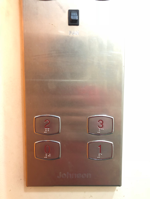
You absolutely have no idea where each floor will take you to. Heck! You might even end up in a floor with restricted access. You never know.
But, with an elevator panel like this:
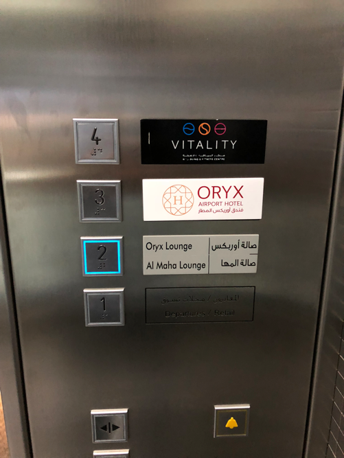
You will know where each floor takes you to, making it easier to get around.
What can we learn from this?
It's always good to inform the user where each action would likely take them to. This will ensure that they don't feel lost and that they're taking an informed decision.

Source: Dribbble
This can be applied to progress bars in wizards each step would require a title to keep the user informed what each step is for.
Parking Lots
Have you noticed the ♿ sign in parking lot in malls? It informs the drivers that they can park there only if there's a physically challenged person in the vehicle with a valid permit.
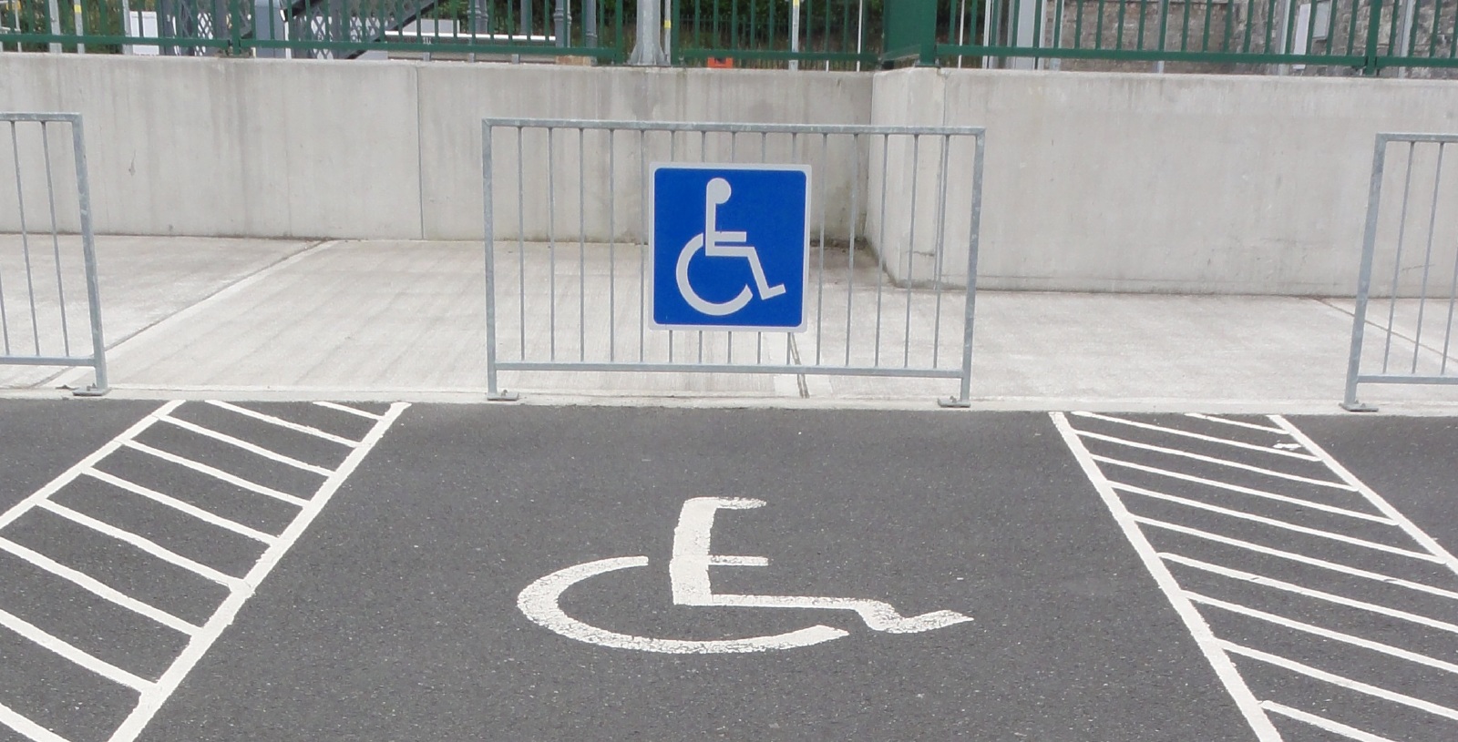
If there was no such sign in the assigned parking spot anyone would park their vehicle there, making it difficult for someone who would actually need it.
What can we learn from this?
If there's an action a user can only perform if certain conditions are met(like in the example above), it's good to inform them about it.
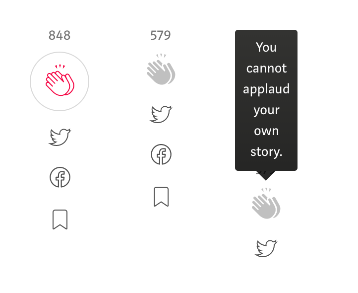
Source: Medium
Medium does a wonderful job at it. You can clap for articles written by others but not for yours. If Medium hadn't informed the user that they cannot applaud for their own story, it would've put them in a fix as to why they cannot clap.
This removes any chances of ambiguity that may arise in the users mind.
Pokemons
If you remember the good ol' Gameboy days where you start of with a starter pokemon(mine was Charmander), you'll remember that you have to work your way through the game to fight battles, collect berries and fruits, level up your pokemon in order for it to evolve to its other forms.
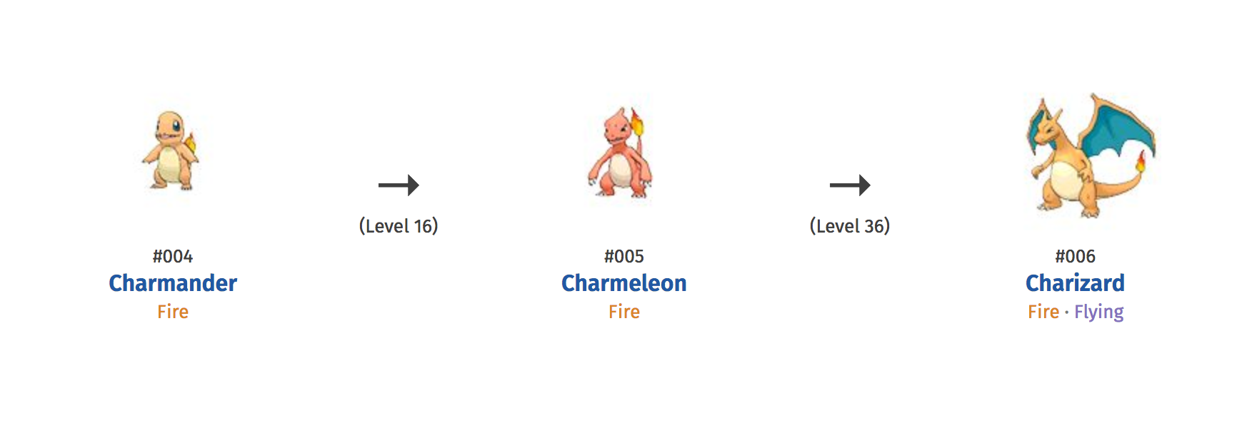
Source: Pokemon DB
You may be wondering what can you possibly learn about design from Pokemons. Well, here are a few things that I have learned from them:
-
When you design a digital product, there would be a few educated assumptions and informed decisions from user research which you would've taken. Now when this digital product goes for user testing or out into the market, it's battle time(just like the way you fight your pokemon with another). All your educated assumptions and informed decisions will be put to test.
-
In a pokemon battle, if you were successful in defeating the opponent you'll gain more XP aka experience points that'll put you on the path to your next evolution form. But if you lose the battle, you would have to heal your pokemon with berries and fruits to bring it back to life.
-
Similarly in designing digital products, if the design solved the problem which you were aiming to solve, you improve the user base and engagement. But if it failed to solve the problem, you have to learn from the failure to fix things that are broken. Both making the digital product much more matured and evolved. Just like pokemons.
These are a few things about design which I learned from the real world. Everyday try paying close attention to the physical objects around you. There's always something you can learn about design from them.
