A common mistake UX designers make while designing a digital product is they miss out on paying attention to empty states. It leads to the detriment of user’s experience and adds to the user’s cognitive load.
Designing for empty states is as important as designing populated screens. The questions to ask yourself while designing for empty screens are,
- Why is there no data?
- How to add data?
- How to make the user add data?
- How to show the user the process of adding data?
Answering all these questions will lead to the perfect empty state which will lead to an adaptive user base. Having an adaptive user base is any day good for business.
The users are faced with an empty state on landing on the platform and there is no data populated. The other scenarios are when the data is cleared or when there is an error. Treating these states right and giving it it’s due importance will elevate the user’s experience. Let’s see how each of these scenarios can be dealt with.
First Use
The first time the platform is being used the user is going to be met with empty screens. What the user sees at this stage is very important. First impression is the best impression and if gone wrong it is very difficult to overcome. Based on what the context is the empty screens have to communicate the following,
- The user has to be informed about the empty screen, the whats, whys, and hows.
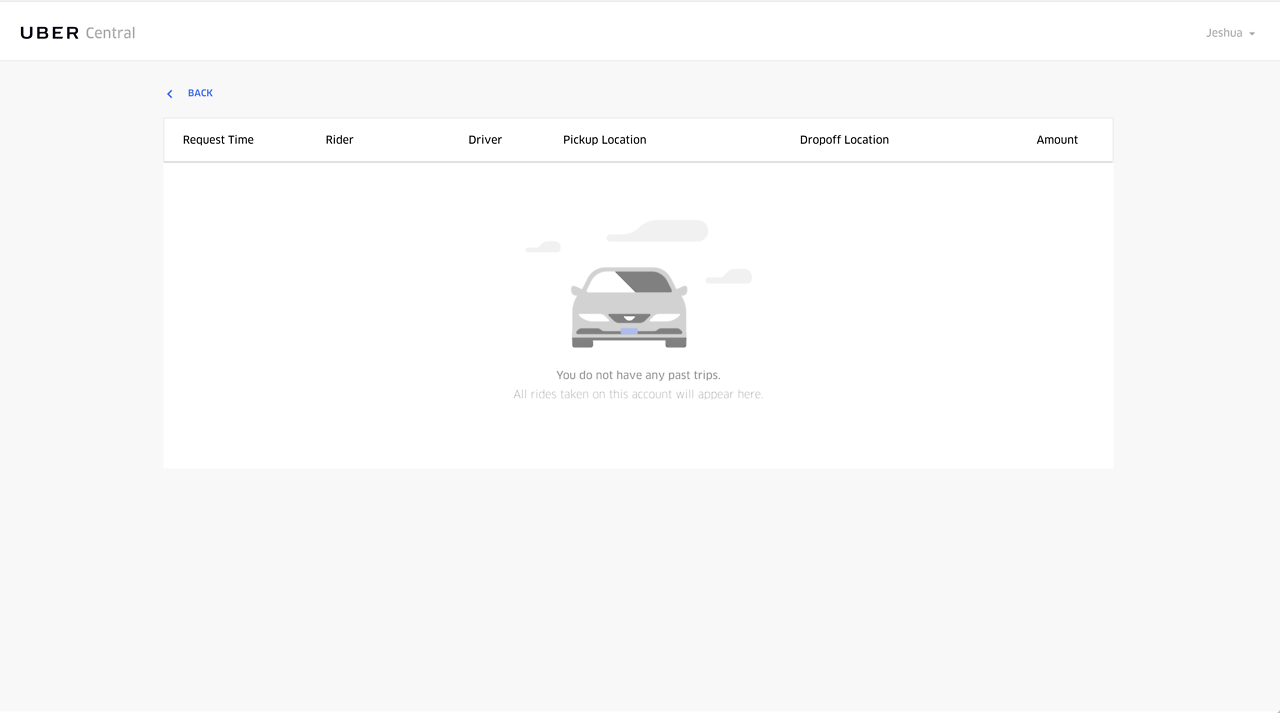
The user is informed about why the screen is in a empty state
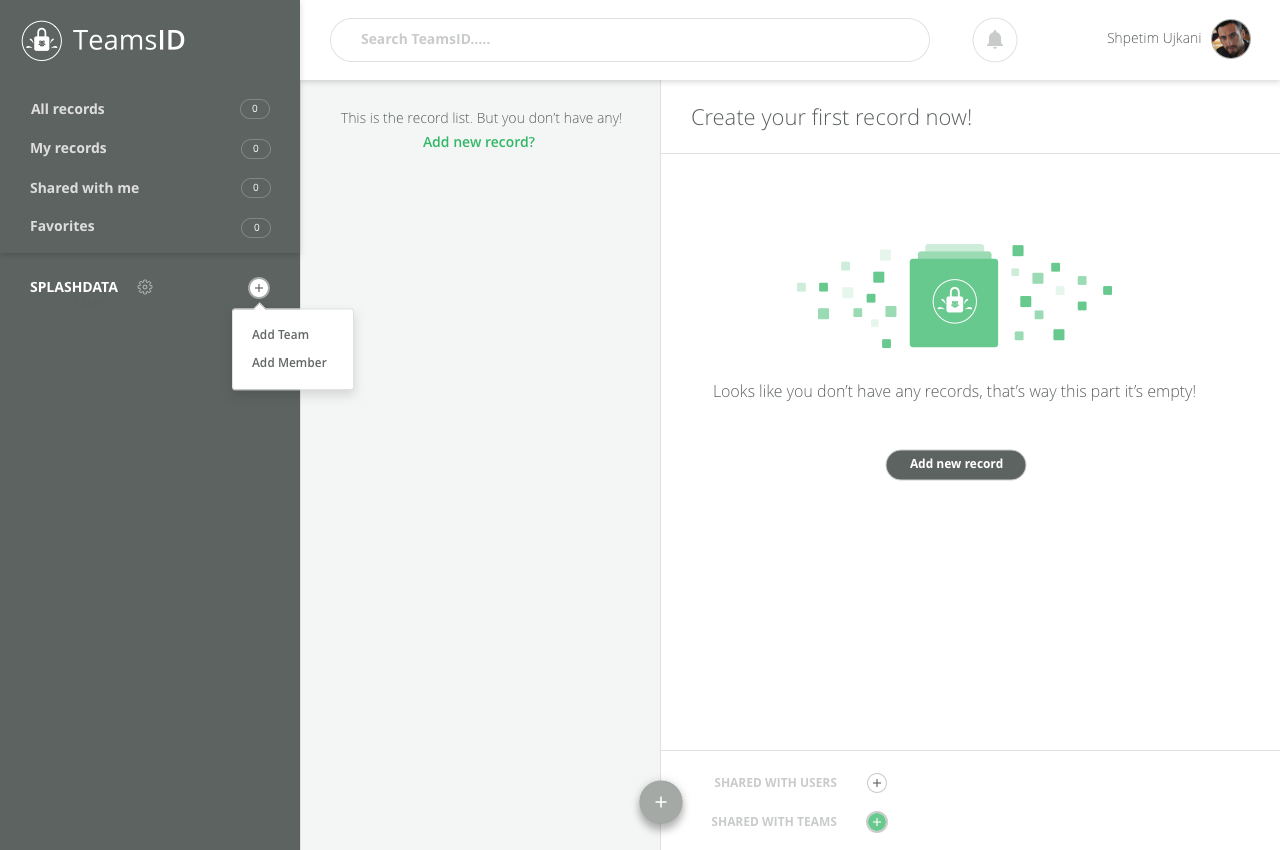 The user is informed of the whys
- The user has to be prompted towards taking an action to populate the platform.
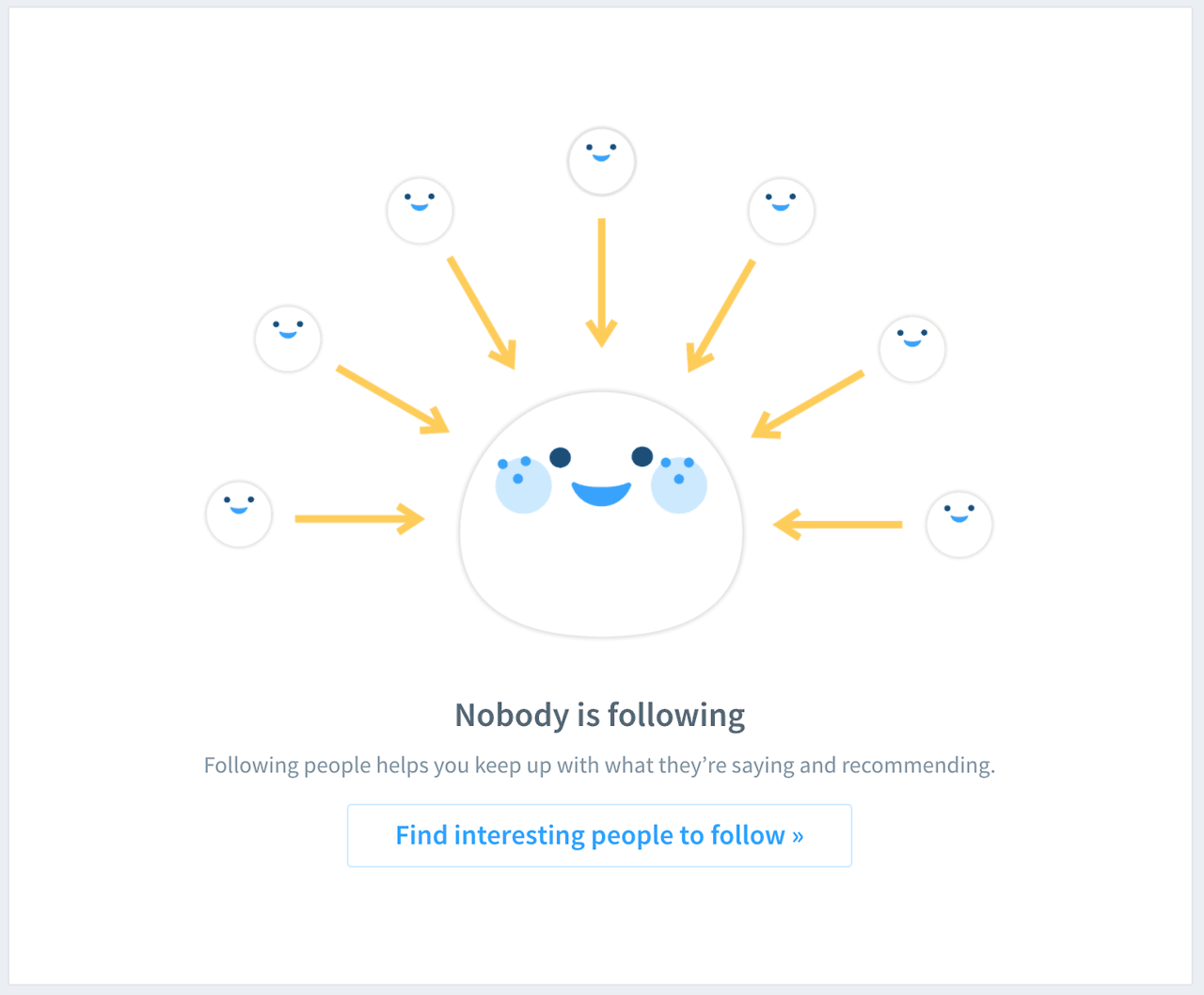 The user is prompted to take an action.
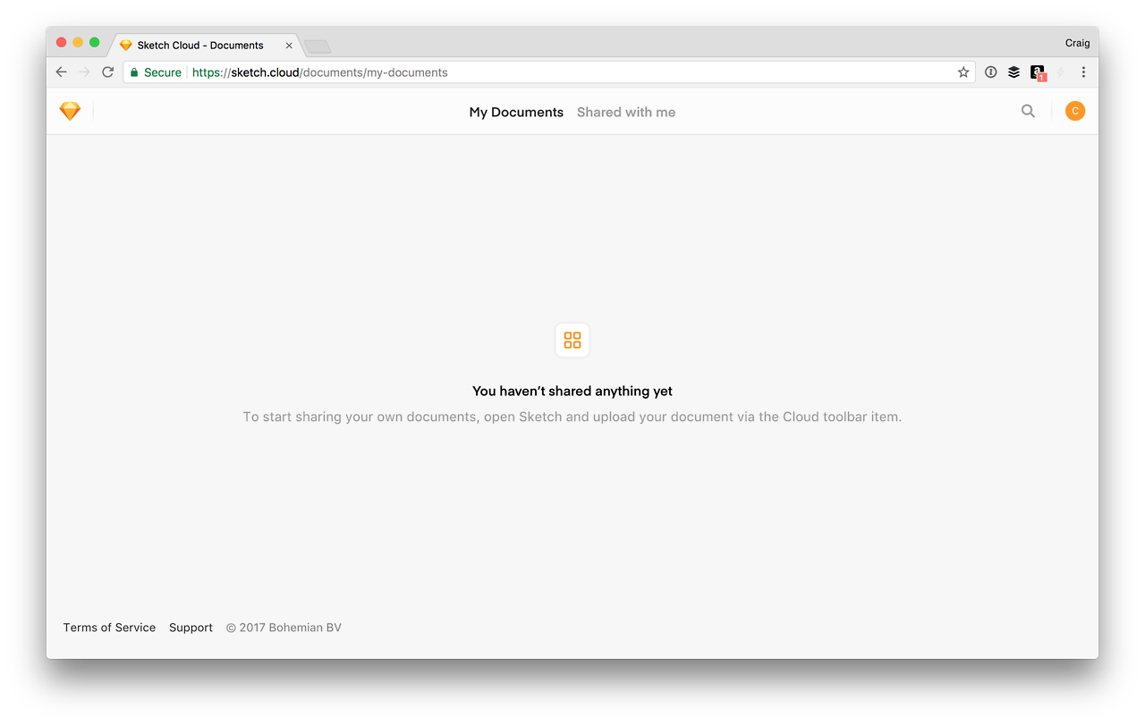
The user is educated about how the platform works
Data Cleared
If data is cleared and the user is faced with an empty screen the user has to be informed about re-populating the platforms and the ways and means to do so. If clearing the data is a positive task then the user must be rewarded for such actions, but if it is a negative task then the user must be made aware of his actions.
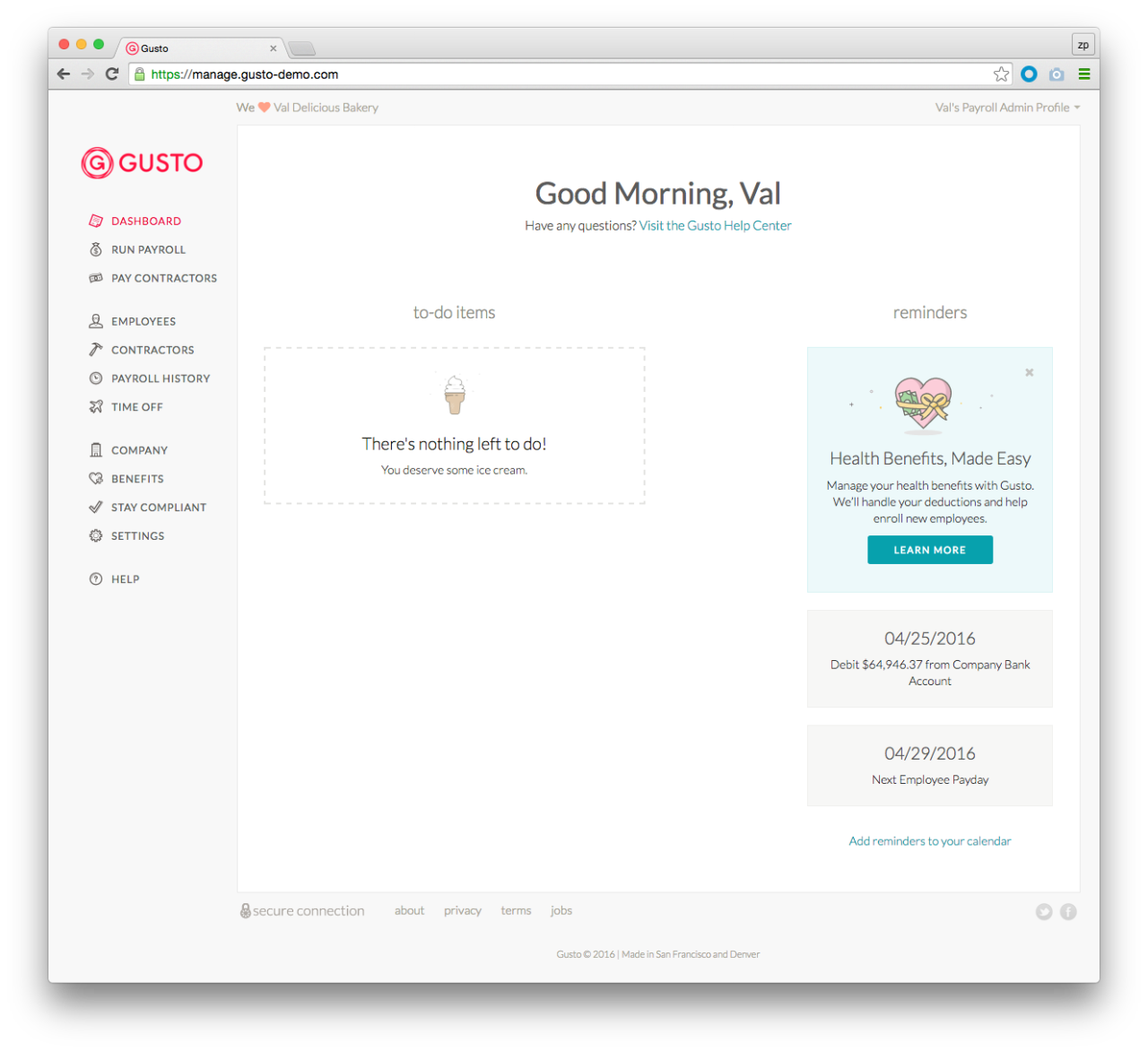 The user is rewarded for completing all tasks
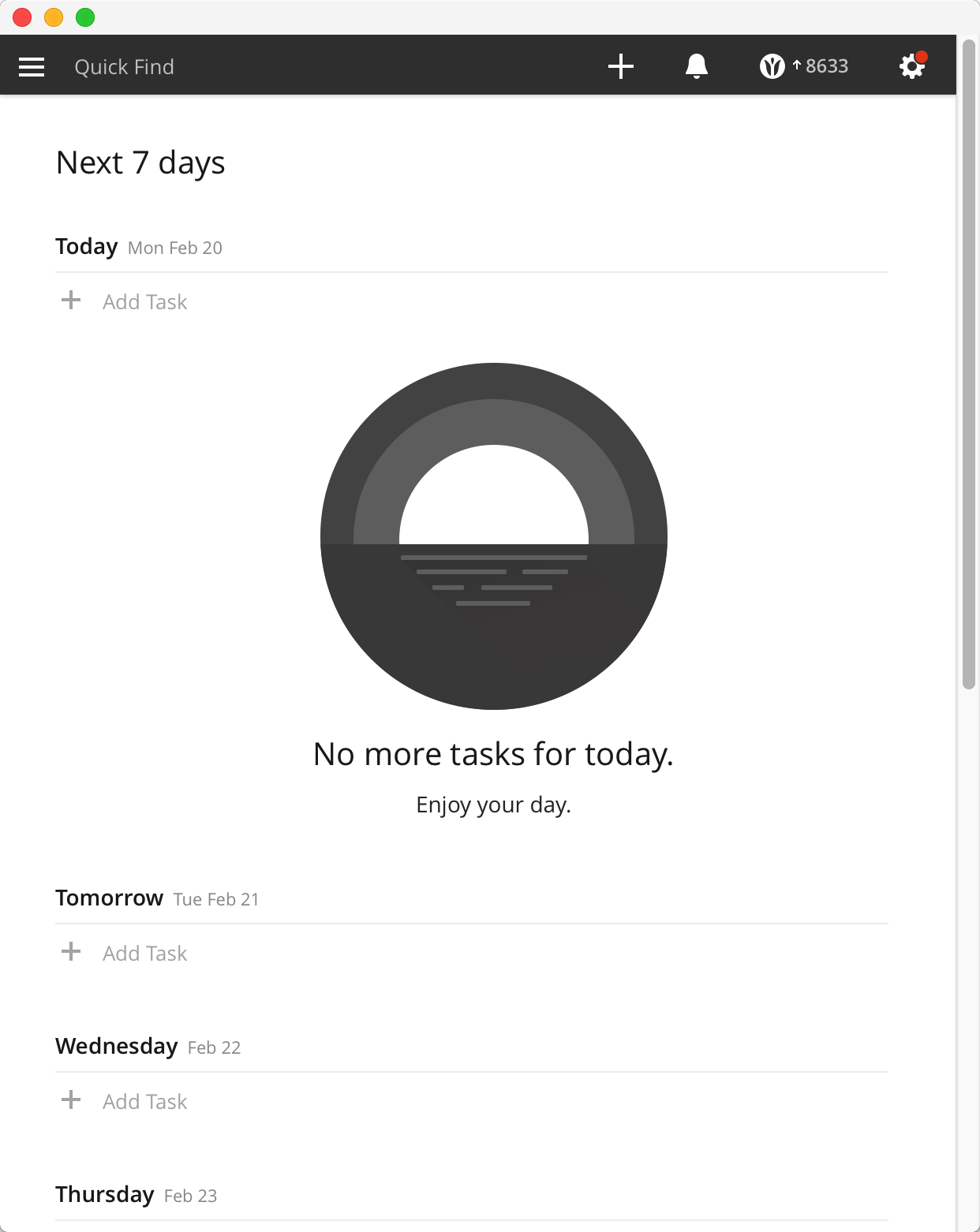
Positive words as encouragement for completing tasks
Error
This is a tricky situation. The user has to be made aware of the situation but should not be actively held responsible for it. It should not be a ‘in your face message’ but rather an escape route should be mapped out for the user to take the right next step and get out of the ‘error’ state.

This is a not preferred. It would be nice to inform the user of why the error happened and show them the right way.
Empty states caused by the absence of internet should be dealt with differently. Components or elements to engage the user offline should be incorporated to keep the users on the page. If not for long at-least for a minute, hoping the internet is back by then.
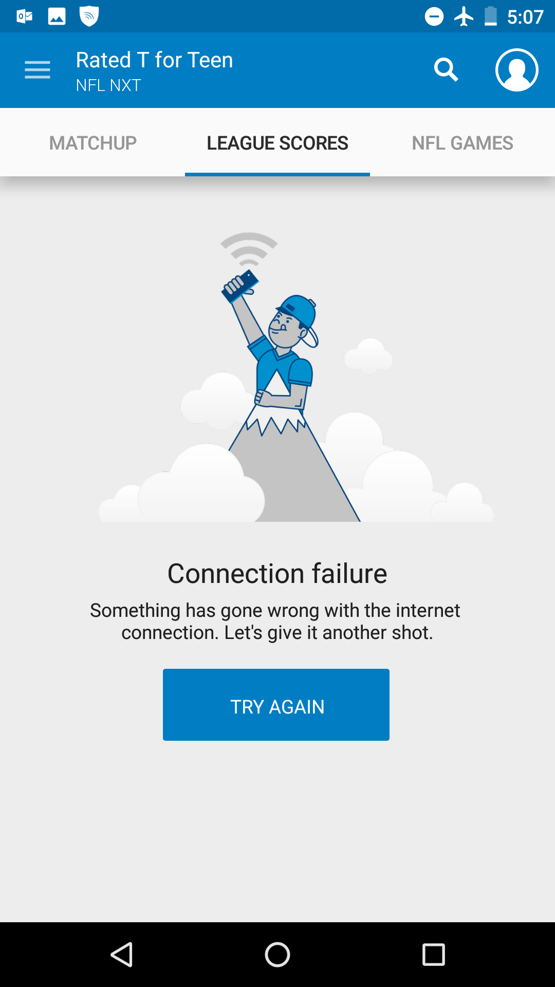
The ‘TRY AGAIN’ CTA keeps the user engaged on the screen by promptimg to carry out an action
Anthropomorphism
Anthropomorphism is adding personality or human traits to non-human things. Using anthropomorphism in the empty states helps the platform connect with the user. It sets the tone of the dialogue between a human (user) and a thing (platform). Anthropomorphism in my perspective is the one global route to tackle empty states. It can be reflected in text and illustrations. It will progressively prevent the detriment of the user’s experience.
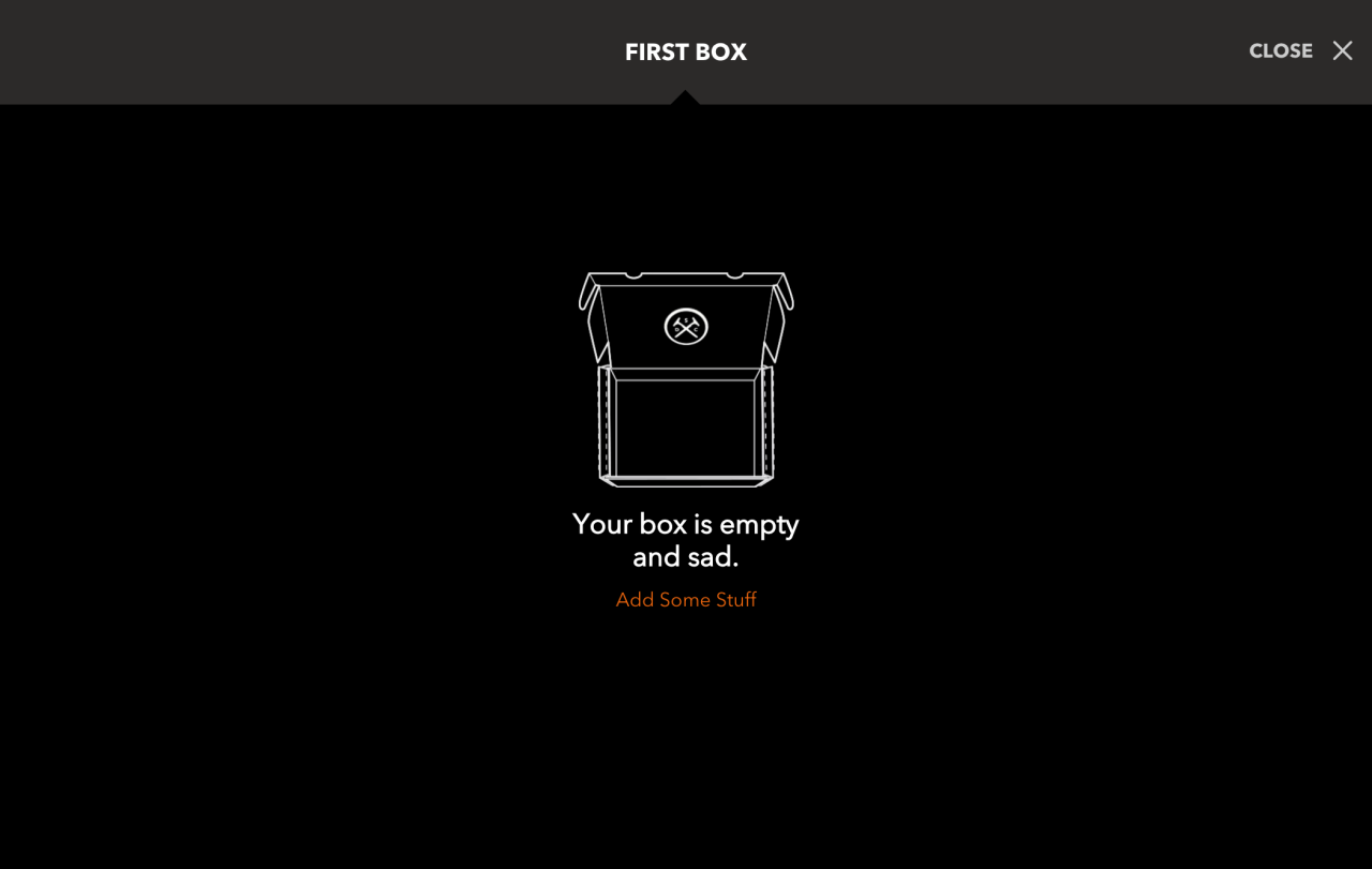
Adding a human emotion like ‘sad’ to the empty state is anthropomorphism
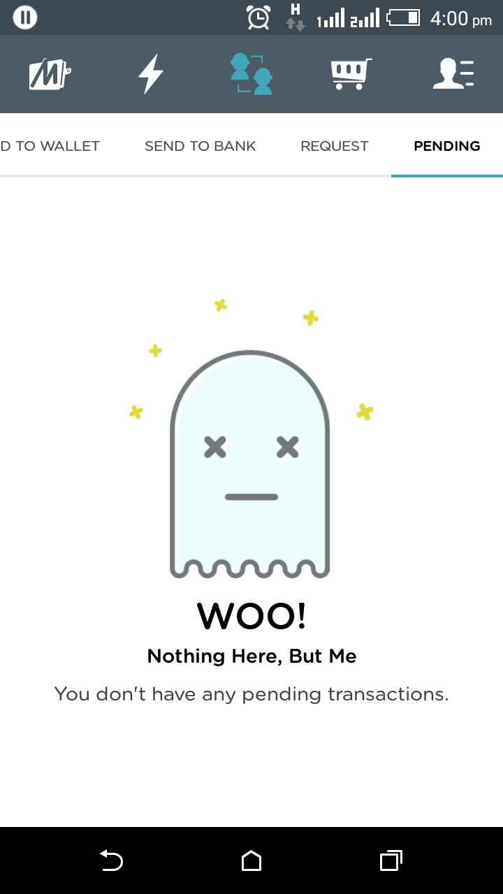
Adding personality to the empty screen strikes a cord with the user
So, clearly empty states has got a lot more to think and design for than just leaving it empty. It connects with the users and creates a tone in the conversations. Lets make empty states as important as the platform itself.
Subscribe to our newsletter
Get the latest updates from our team delivered directly to your inbox.
Related Posts
11 things I learned as Designer in 11 months
The trials and triumphs of a self-taught designer. This might even be your story too - why don't you read and find out.
19 Cool Figma Plugins you need to know
Figma plugins are making our lives as designers easier than ever. Here is a list of 19 cool Figma Plugins you need to know to get design superpowers.
22 design quotes from experts you need to read when you're feeling stuck
Does this question "How can I make this design great" keep you up at night? Looks like it's time for some motivation. Here is a curated list of quotes from great design experts who wanted to share their wisdom with their designer friends. 22 thought-provoking ideas you don't wanna miss.

