
Flex is used to create whole modules or blocks that can contain responsive elements in it. Many grid systems( Bootstrap , foundation ) whose SASS/SCSS I observed carefully follows the conventions of flex. Positioning components and objects in vertical or horizontal stacks is possible with flex. A flex’s alignment is identified along the main axis and cross axis. Main axis is generally horizontal, but it can be made vertical by using flex-direction property. Flex is responsive and flexible by itself, and it aligns the flex items in the right position with respect to the other flex items in the flex. The grids below are flex items wrapped inside their flex-box or flex-container.

Flex is defined within the display property. IE-10 and IE-11 offers partial support to flex when prefixed with -ms-. Android 4.3 provides partial support with -webkit- prefix. Edge, Safari, Chrome, Firefox, Opera and Android browsers above 4.3 provides full support to the updates of flex.
Since flex is a block or whole space aligning/altering property, it is supported by many sub-properties which can work on the parent flex and the child flex-items.
Sub-properties that a flex-box can have
- flex-direction
- flex-wrap
- flex-flow
- justify-content
- align-items
- align-content
Sub-properties that can alter the flex-items in the flex-box.
- flex-grow
- order
- flex-shrink
- flex-basics
- flex
- align-self
Lets make sure we get to understand the sub-properties clearly one after the other.
Sub-properties of flex-box
Flex-direction
This is used to specify the direction in which the main axis should fall. By default, the default direction is row.
Syntax of flex-directionOn changing the value in flex-direction property, we can change the direction of the flex-box axis in the window. For instance, the snippet below inverses the direction of flex-items in the flex-box.
Row-reversal of flex items in flex box
Flex-wrap
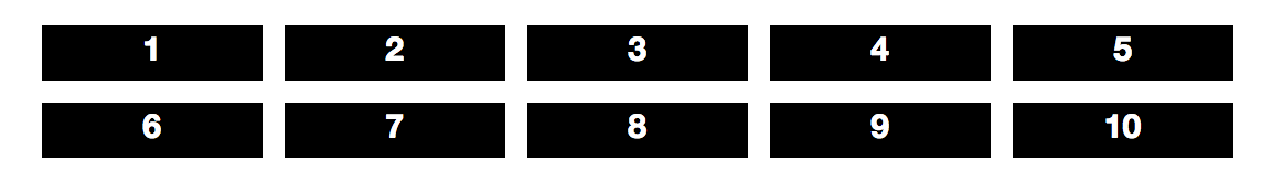
We make use of flex-wrap which is as same as the wrapping options in any text editor to wrap the contents of the flex-box in the next line. The flex-box auto adjusts the spacing and renders the flex-items in the next line. By default, we have the nowrap active, which doesn’t wrap the flex-items of the flex-box.
Syntax of flex-wrapThe following is the flex-box with the flex-items that are already illustrated above. We have made use of nowrap here, and all the flex-items are arranged within the same flex-box.
Flex no-wrap
Flex-flow
Flex-flow is a combination of flex-direction and flex-wrap.
Flex-flow syntaxOther than specification of the two distinct values to style the flex-box, we can make use of initial and inherit where initial sets the default value while inherit inherits from the parent flex-box.
Direction reversed wrapped flexbox
Justify-Content
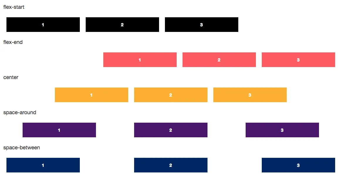
This is used to align the flex-box contents along the main axis. This has five property values: flex-start, flex-end, center, space-around andspace-between.
- flex-start: Pushes flex-items to the starting of where the flex-box starts.
- flex-end: Aligns flex-items to the end where the flex-box ends.
- center: Adjusts the space to align the flex-items to the exact center of the flex-box.
- space-around: Adjusts space around the flex-items in the flex-box.
- space-between: Adjusts space between the flex-items in the flex-box.
Code snippets of values that can go well with justify content property.
Output of justify content in flexbox.Align-Items
Align-items is used to align the flex-items along the vertical or cross axis. This has five property values: flex-start, flex-end, center, **baseline **and stretch.
Align-Items syntax.- flex-start: Pushes flex-items to the starting of where the flex-box starts in the cross-axis.
- flex-end: Aligns flex-items to the end where the flex-box ends in the cross axis.
- center: Adjusts the space to align the flex-items to the exact center of the flex-box in the cross axis.
- baseline: Aligns the flex-items along the baseline of the flexbox.
- stretch: Stretches the flex-items along the cross axis.
Code snippets of values that can go well with align items property.
Align items and the effect they have on flexbox.
Align-Content
Align content/lines are used to align the flex-items contents along the vertical or cross axis. This has six property values: flex-start, flex-end, center, space-around, space-between and stretch.
Syntax of align-content- flex-start: Pushes flex-containers content/lines to the starting of where the flex-box starts in the cross-axis.
- flex-end: Aligns flex-container lines/content to the end where the flex-box ends in the cross axis.
- center: Adjusts the space to align the flex-container content to the exact center of the flex-box in the cross axis.
- space-between: Makes space between the content/lines in the flex-container in the flex-box
- space-around: Makes space around the content/lines in the flex-container in the flex-box
- stretch: Stretches the flex-container content along the cross axis.
Sub-properties of flex-items
Flex-grow
The flex-grow property specifies how much the item will have to expand itself relative to the rest of the flexible items inside the same flex box.
Syntax of flex growCode snippet to show how it works, ul is in flex, and li is the child flex item.

The over-grown 1st element owing to flex-grow:5;
Flex-order
“Order” sub-property of the flex items manipulates the order in which the flex items are arranged. The items that are not ordered are aligned at the beginning assuming they should be listed first.
Syntax of flex order Code snippet illustrating flex ordering
Flex-shrink
The flex-shrink property specifies how much the item will have to shrink itself relative to the rest of the flexible items inside the same flex box. It is opposite to the flex-grow property.
Syntax of flex shrink Code to illustrate flex-shrink on flex-item
Flex-Basis
Sets the base width/length of the flex items in the flex box.
Syntax of flex-basis Flex basis code snippet
The nth-of-type(2) with 100px flex-basis while the width of other elements are 250px;
Flex
Flex, the sub-property of the flex items, is shorthand combining flex-basis, flex-grow and flex-shrink. This property determines the length of the flex items but doesn’t really give any regard for its contents.
The flex syntax.Code snippet defining flex sub-property of flex items.
So, flex combines grow, shrink and basis together completely disregarding the contents size.
Align-self
Align-self is to specify alignment property for one particular flex-item where ever it is called in a flex-box.
Align-self syntax The align-self code snippet. The center aligned Flex — item-1The images that I’ve used in the article are screenshots of the actual flexbox and flex items. To understand the responsiveness of the flex, follow the flex box tutorial .
Subscribe to our newsletter
Get the latest updates from our team delivered directly to your inbox.
Related Posts
Accelerated Mobile Pages (AMP) using Middleman
Learn about how to make AMP Pages using Middleman in this part 2 of Using Middleman Series!
AMP - Showing you the Need for Speed on your websites
We finally got behind the hype of AMP and tried it out, here is what we learned.
Best Mac Apps for a Web Designer
Every Web Designer and Developer has a stash of their favourite, go-to apps. Hear from our Web Designer about his list, and you might even find your favourite in here!