What is a landing page?
It is the entry point to a platform that enables the user to perform an action that leads to positive conversion for business. It should convey the necessary information in a short, to the point and succinct manner. The landing page should not be tied to the website by any global navigation. This limits the options that the user can interact with and guides them towards conversion. Landing pages are of two types,
1. Click Through or Step Page
A Click Through or as I like to call it, a Step Page landing page is typically used to provide enough information to help the user make a purchase decision. This is a page that directly helps in conversion. This type of landing page is usually used in e-commerce sites where the user should be given enough information of the product to enable him to make an informed purchase decision.
Appropriate Usage
When the users click on an advertisement and is directed to a cart he is less likely to make the purchase in comparison to when he lands on a Step Page. If the user is directed to a step page when he clicks on an advertisement he is given enough information to make an informed purchase decision. Likelihood of conversion is higher when a Step Page is used.
Examples of a Step Page landing page
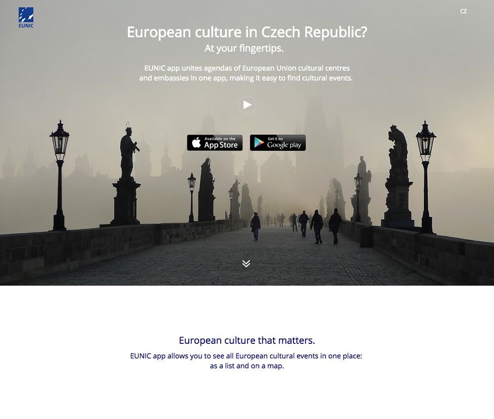
The landing page communicates exactly what the app is for and CTAs of where you can download it from
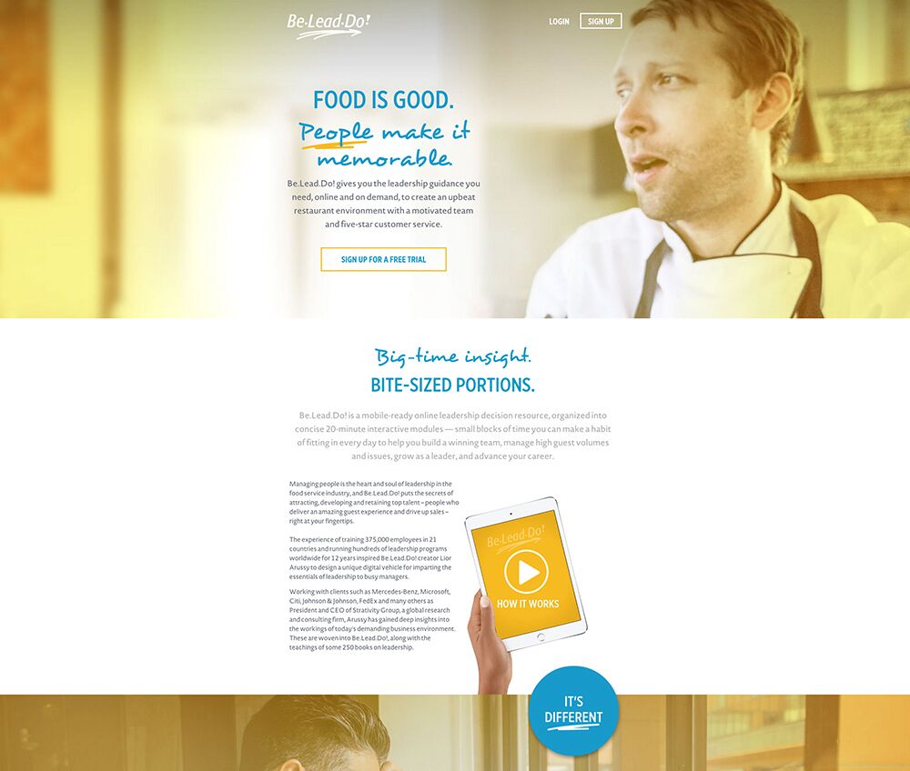
A small description of the product and the CTA before fold followed by detail explanation of the product.
2. Lead Generation
This kind of landing page is used to collect user data like name or contact information which can be used at a later time for marketing a product. Details of what the user will get in return will also be mentioned. The page usually contains a form and a description of what you have to fill and why. The important point to note here is to keep the form as short and concise as possible. Only the information that is needed should be asked for, nothing more. A very lengthy form at this juncture will lead to negative conversion.
Examples of lead generating landing pages
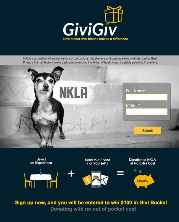
The form is short and the description is illustrative and to the point
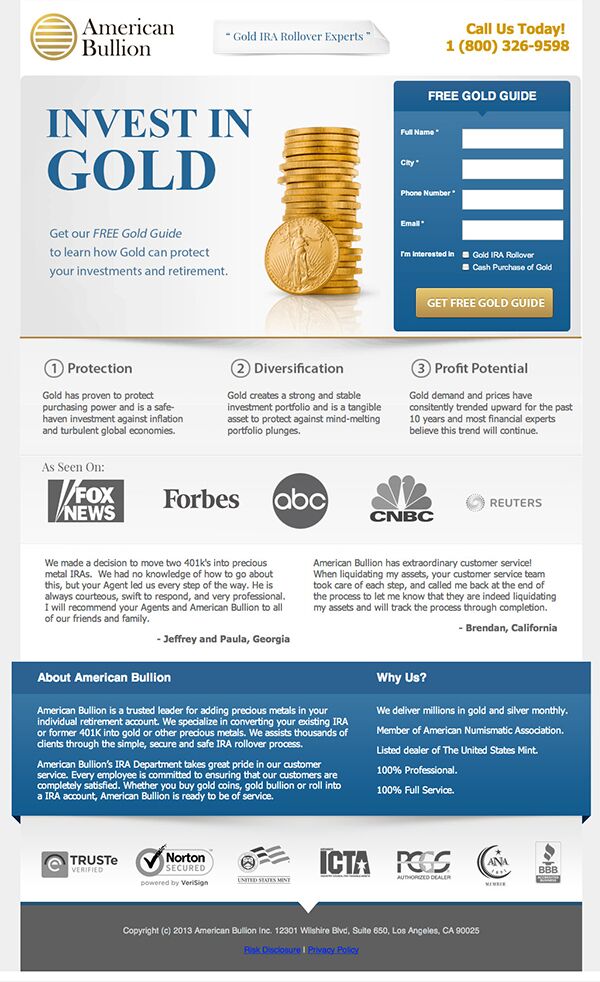
The user is going to be contacted either through email or phone. So, asking the user both these details is redundant at this point. This might lead to poor lead generation.
3. Few things to keep in mind while designing a landing page:
- Keep the CTA above fold, bold and prominent.
- Direct the user's attention to the CTA.
- Be succinct with your information.
- Keep the design simple. Don't distract the user with unnecessary design elements.
- Show the product used in context.
- Display clientele and their testimony to increase authenticity and dependability.
- Highlight what the users get in return on interacting with the land page.
- Avoid linking the landing page to the website using any global navigation.
- Make the page a conversation and let it emote.
4. A Landing Page has to emote
After a user interacts with a lead generating landing page, it has to emote back to the user. It should be a smooth conversation between the user and the landing page. The user should be made aware that his action of filling the form is appreciated and he will be rewarded for the same. You can use this as an opportunity to extend your conversion and tell the users about the next steps.
This is it about landing pages for now. Get started designing your own landing page and if you are having any trouble give us a ring. Our expert team of designers (if I can say so myself) and developers will build it for you. 🙂
