Discovery
Product
TV remote
Target Audience
Elderly people (60+) Elderly people above the age of 60 are mostly
- retired (if in government jobs) or
- have started to delegate or pass over business to their successors
- Homemakers
Their declining health/energy level/motor skills make them take a step back in life and opt for more leisure activities during the day. One such is watching TV. Fine motor skills would be important in using a TV remote, and with its steady but slow decline it is important to make the user's experience with a TV remote as easy, smooth and direct as possible.
Goal
To design a TV remote which older people (60+) can use with ease and without strain.
Design
The design will be based on the primary and secondary research. The design phase will be carried out assuming that the remote is to access only the TV and not any other connected devices (set-top box, dvd player etc.).
Design deliverables
To provide a rough sketch of the remote with documentation of the thinking process.
Design deliverables does not include,
- Production which would be the hardware of the remote.
- Technology used in the remote signals.
Validation
The design will be validated through user feedback, based on which the design will be iterated.
Research Plan
Methodology
Primary research:
- A minimum of 3-5 interviews (remote or in-person) will be conducted where open ended questions will be asked. Each interview will last a maximum of 10 minutes.
- Surveys were avoided as it might be a little too daunting for the target audience to fill.
Secondary Research:
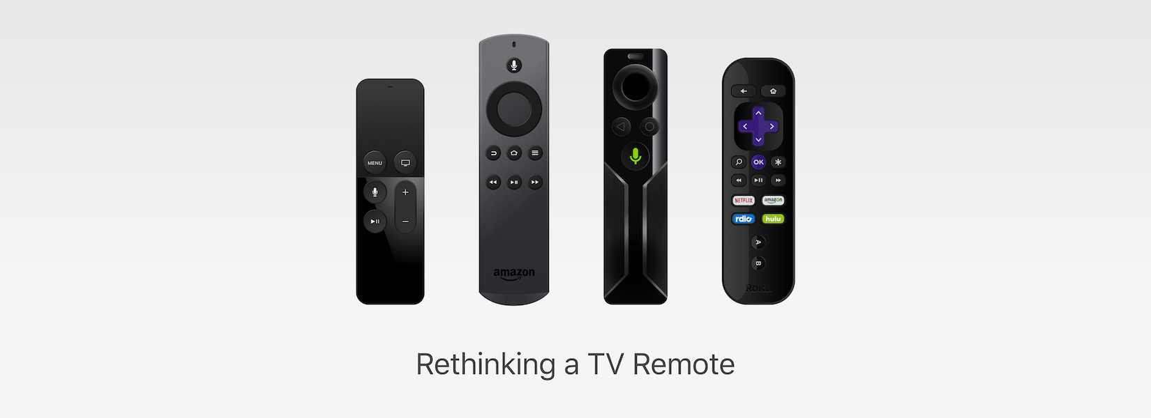
- Taking a look at existing TV remotes designed for the elderly.
- Collecting data about designing for the elderly.
Participants
The primary characteristics of the study's participants:
- Age: 60+
- Retired (if in government jobs) or
- Have started to delegate or pass over business to their successors
- Avid TV watchers
Interview Questions (conversation will not be limited to the below questions)
- How often do you watch TV? How many hours a day?
- How do you like using the remote control that comes with your TV?
- How important is it for your remote to be easy to use?
- What do you like in it?
- What don't you like in it?
- What do you think about the size and shape of the device?
- What do you think about the size and shape of the buttons?
- What would you want to change about your remote?
Primary Research
Interviewing 6 users from the target audience helped me empathise with the problems and difficulties they faced. The interview questions were the ones mentioned in the research plan, but was not limited to just that. Their responses to the questions led the conversation ahead and everytime we went on a tangent from the main topic of the interview I was able to steer the conversation back towards the right direction.
After the evaluation of the gathered interview data I extracted the relevant information to find the user's pain points.
- Too many tiny buttons on the remote confuse them and they have a tough time pressing buttons with precision. They end up pressing more than one button not letting them carry out the function they meant to.
- They like to have a better grip on the device without their finger accidentally pressing on buttons.
- Majority of the respondents hold their remotes in one hand and operate it with the other. Although 2 of them did operate the remote while placing it on a center table.
- I learned that the elderly are creatures of habit and have a fixed set of favorite channels. On an average 5 to 6 channels, that is the only TV they watch.
- A bigger size of the remote would be more convenient.
- They don't realise when the battery drains out and end up getting frustrated when the buttons don't work.
- They don't find the remote sometimes in the place they usually would keep it, and a small dark coloured remote becomes difficult to find.
The data gathered from the interviews were similar across all participants and so I didn't find the need for empathy maps or personas.
Secondary Research
Remote Body Colour
- To make it easier for reading very dark coloured text on a white background should be used
- Patterned backgrounds should be avoided.
Remote Body Material
- The material used to make the device should be lightweight and slip resistant.
- The texture of the material used to make the body of the remote should not be slippery on touch. The texture should be easy to grip.
- Glossy effect should be avoided as it creates glare that can make reading hard.
Buttons
- Extra large buttons
- Non-slip texture
- Bright and easily visible on the remote body.
- Inactive space between buttons should be at least 50% of the button's width.
- The On/Off button can be further isolated to avoid accidental activation.
Text Color
- As you get older, yellow, blue and green become increasingly difficult to differentiate from each other if they are used in close proximity to each other, especially if the user has cataracts. Yellow can almost disappear.
- Allow for whitespace as it provides natural places for the eyes to relax and can help the user focus on what they are reading.
Text Fonts
- Fonts should not be less than 14 points and you may find they are easier to read at 16 points.
- Decorative fonts are difficult to read and should be avoided.
- Stick to a regular font that is bolder, with thick lines that are more legible.
Products in the market that empathise with the user's pain points to an extent :
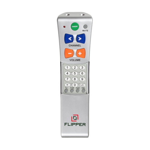
Flipper Remote

Pros
- Very few buttons doesn't confuse the user.
- The buttons are big and bright
Cons
- The remote is too narrow
- The colour of the device is not bright enough
- The flip that hides the other buttons can get loose or break away causing a hurdle in easy use.
- The user has to navigate to the desired channel using the channel buttons
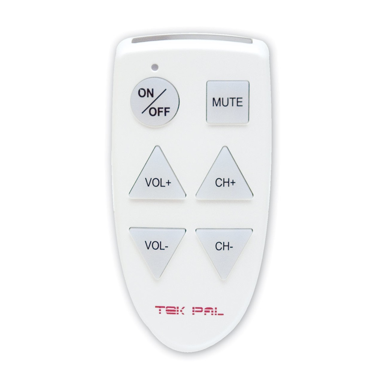
Tek Pal

Pros
- Very few buttons doesn't confuse the user.
- The buttons are big.
- The colour of the device is bright.
Cons
- The remote is too small
- The colour of the buttons are not bright enough
- The font type is not bold enough.
- The user has to navigate to the desired channel using the channel buttons.
Validation
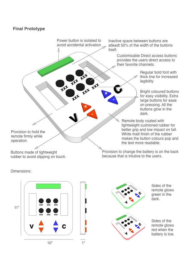
On testing paper prototypes with 4 users in the target audience, iterations were made to the design. Users preferred the remote to be bigger and to have a strong hold or grip. The final prototype is 11" in height, 10" in width and 1" in thickness. With provision to hold the device with both hands helps them get a stronger hold on the remote. Users have the liberty to hold the device in one hand and operate with the other or place the device on a flat surface and operate. The users liked the bright buttons and less clutter. The bold font type was legible. A 3D model of the final prototype gives a better picture.

