There's too much (way too much!) information that flows in into our phones everyday. It has gotten way too much for us over the past few months, that we are literally being pulled away and withoot focusing on the actual work.
One evening, we sat down to think about how we could solve this problem and still consume information in the simplest way possible. One thing that we realized is that we cannot ditch our smartphones. They are awesome, until we install a ton of applications!
Instead of ditching your smartphones and going back in time, what if we created apps that are simple, straightforward and useful? What if these apps followed some standard principles to de-clutter your information consumption? Here are some of the principles that we came up with,
- A very simple UI.
- Super bold and motivating.
- Alive; information should be up to date.
- One thing. Just one single thing at a time.
- Light weight.
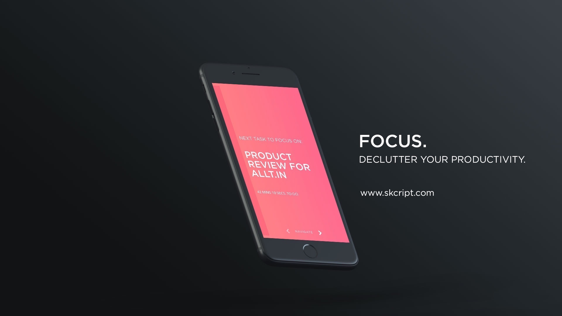
To begin with, we started off with iOS. The first app is something that we call "FOCUS. - Task lister for iOS". Instead of us talking about it, here's how it works:

While writing this article, we have 5 applications planned down the line for iOS that would allow us to de-clutter our information overload. If you would like to test it out for yourself, please tweet this article and tag us on Twitter at @SkcriptHQ.
P.S: These apps are available only for internal use as of now.
P.P.S: A deep study on why De-cluttered apps look the way it does is coming up soon! And yes, we will talk about every single pixel of it.
